Zero Waste Hub
An identity for a circular-economy brand: nothing ends here.
Overview
Zero Waste Hub helps people and organisations rethink, reuse and regenerate: turning waste into worth and building a community around circular living.
I explored three logo routes, each with its own concept, then built the chosen identity into a full system: colour, type, campaign posters, social content, print, merchandise and signage.
Three ways to say “nothing ends here.”
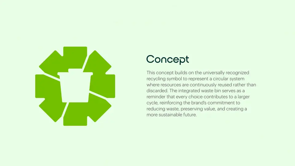
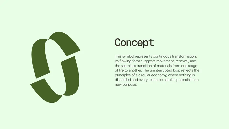
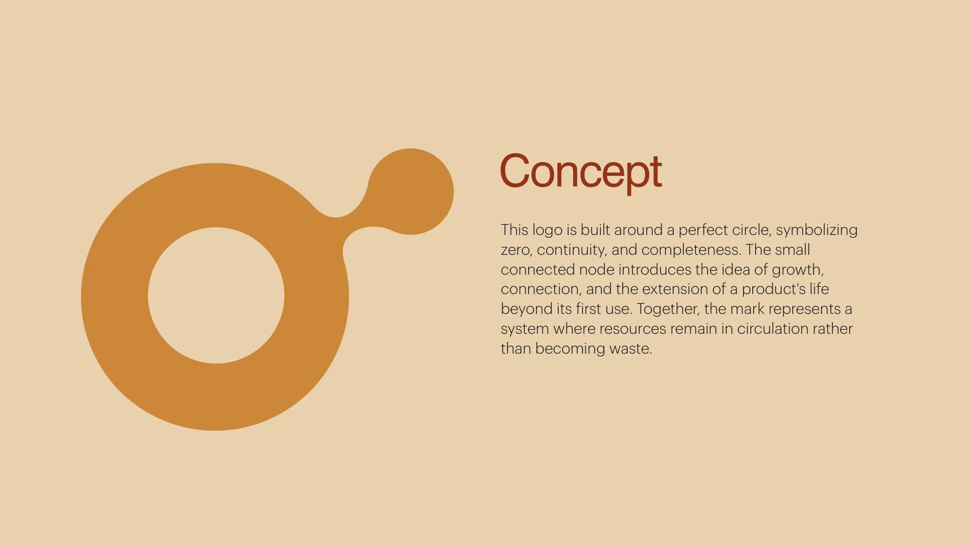
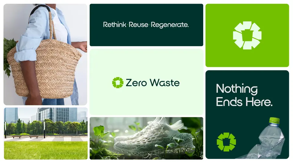
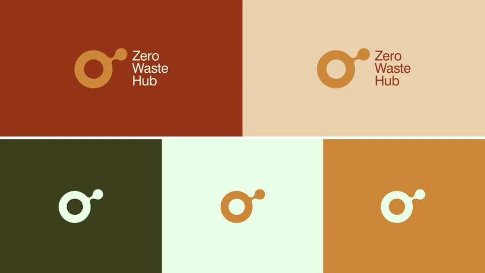
A recycling loop built from a bin, a continuous flowing form, and the chosen route: a circle for zero and completeness, with a small connected node for growth and a product’s second life.
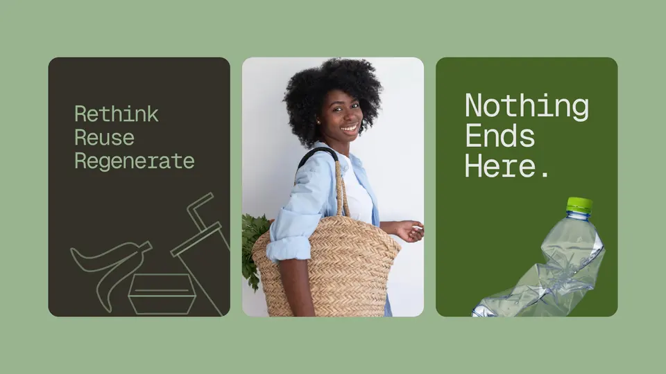
Earthy, warm and impossible to throw away.
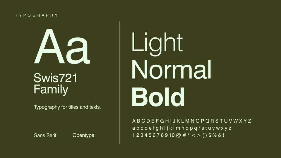
Rust, ochre and olive carry the warmth of reclaimed materials; sand and mint keep it light. Swis721 does the talking, in light, normal and bold.
Typography: Swis721 family
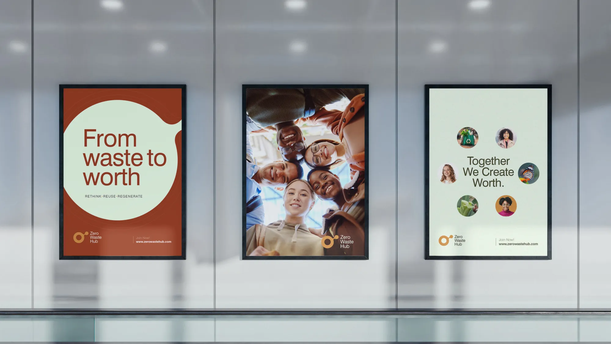
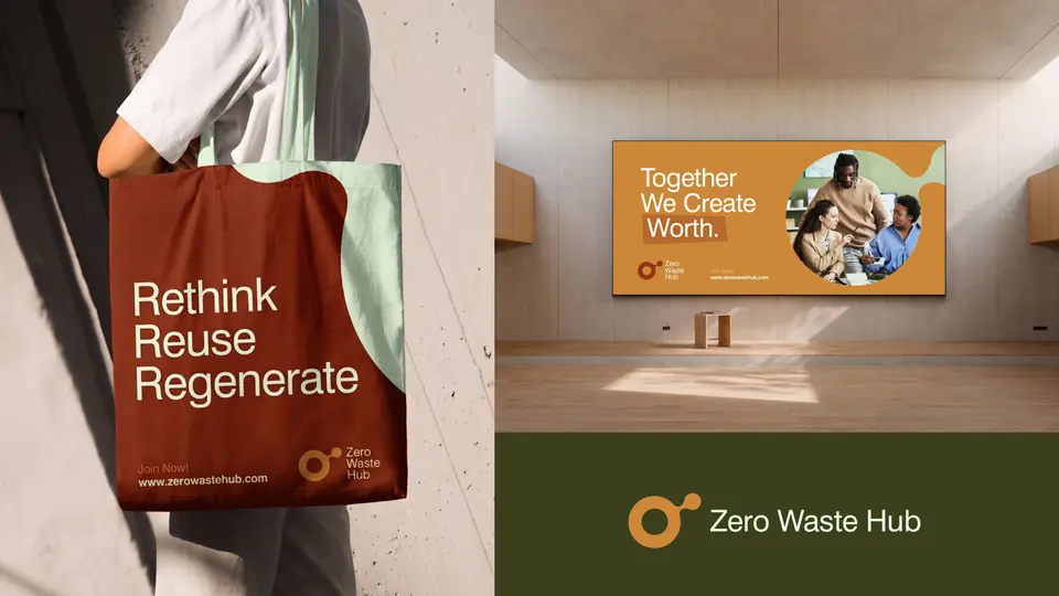
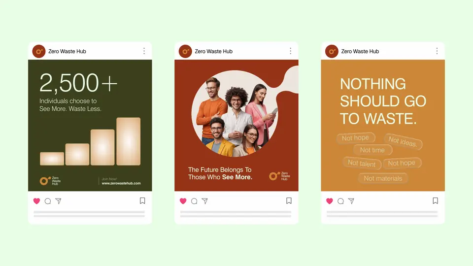
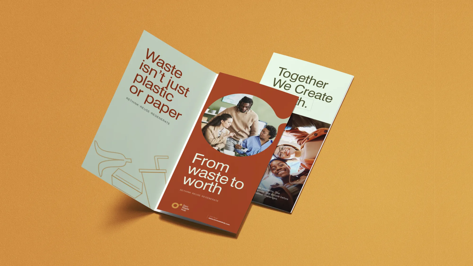
From waste to worth, everywhere it shows up.
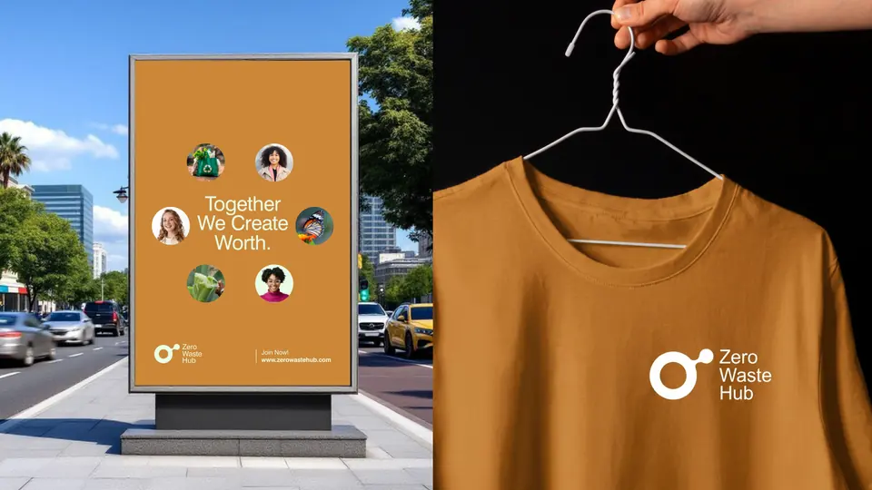
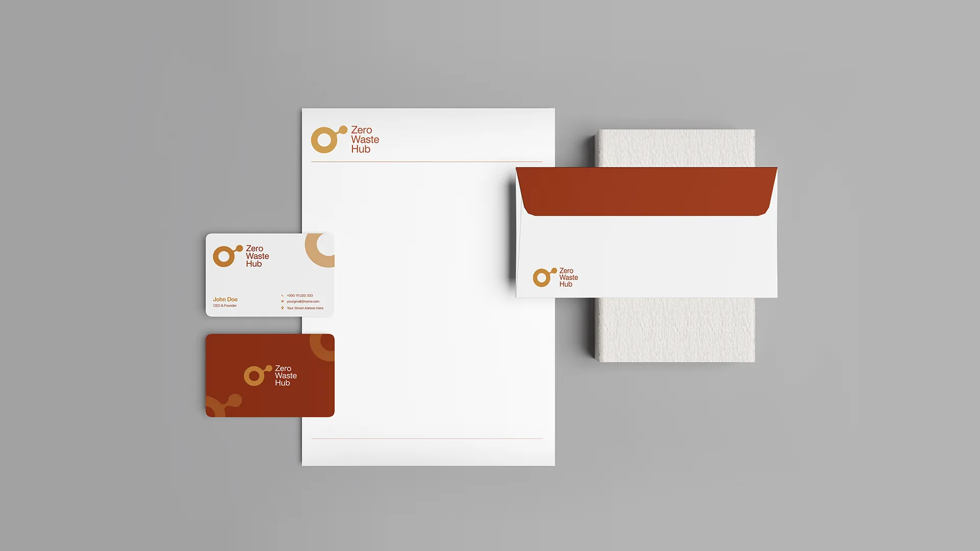
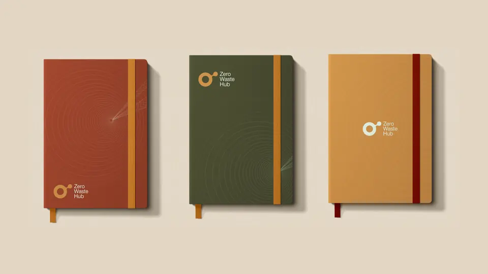
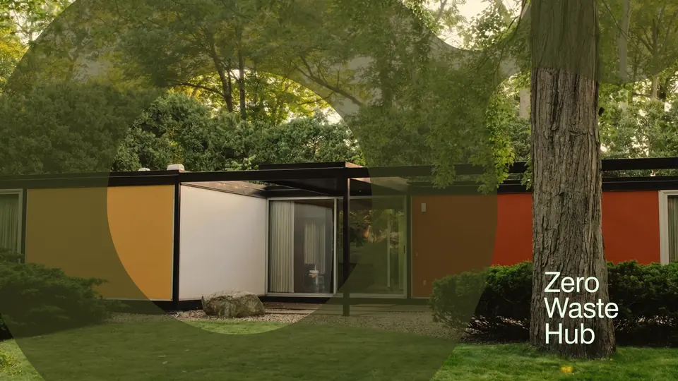
Campaign posters, social posts, a brochure, totes, caps, apparel, notebooks, stationery and building signage, all carrying the same circle and the same invitation: together we create worth.