Polished Seed Academy
A warm, playful identity for an early learning centre: growing bright futures.

Overview
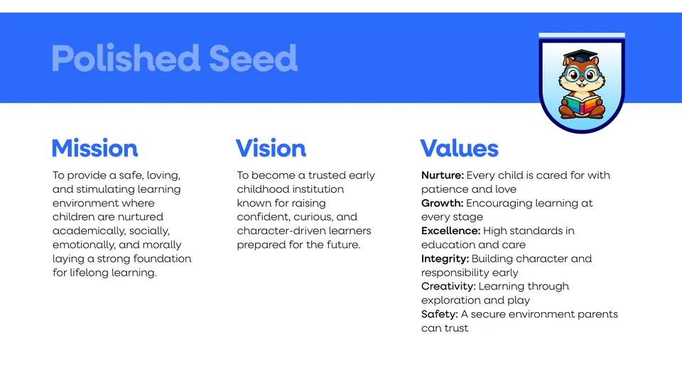
Polished Seed Academy is a premium early learning environment for children from their earliest years through after-school age, blending care, structure, creativity and moral grounding so every child grows into a confident, curious and well-rounded individual.
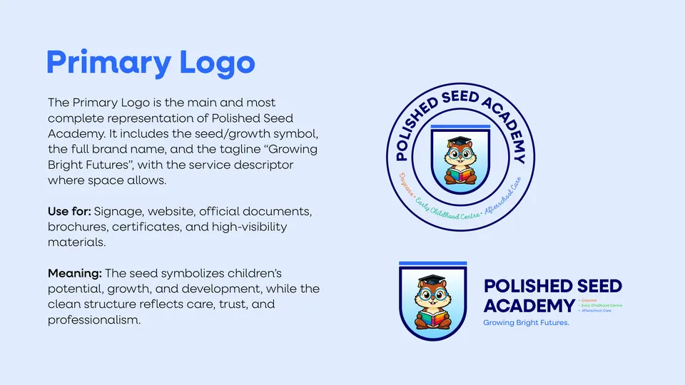
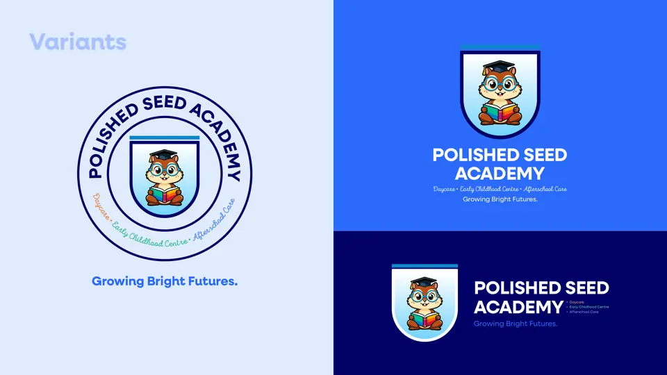
I explored three logo routes and a mascot, then built the chosen crest into a full brand and style guide: mission and values, logo system, colour, type, illustration, imagery and the everyday applications parents and staff see.
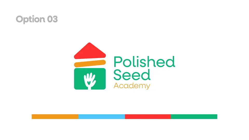
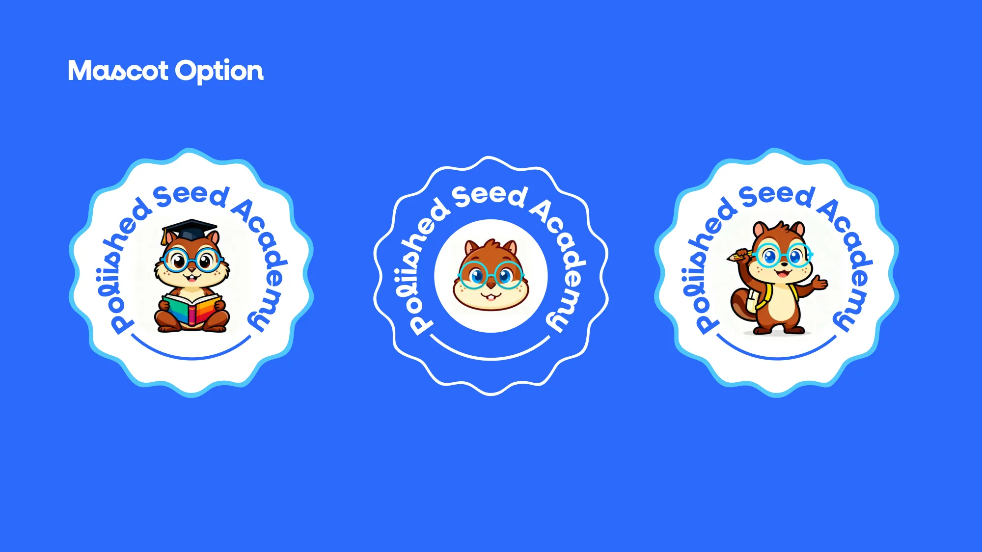
Three routes, and a mascot that won hearts.
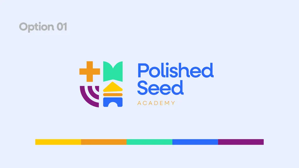
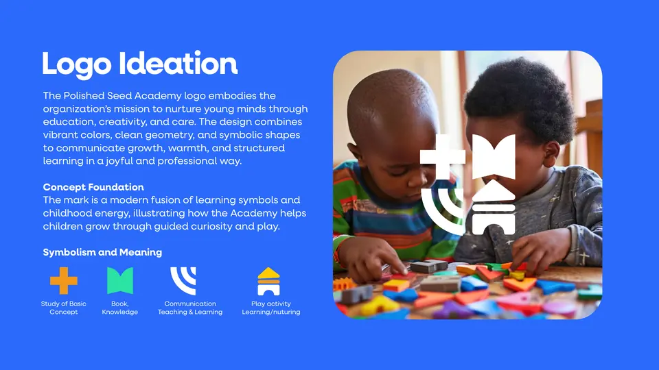
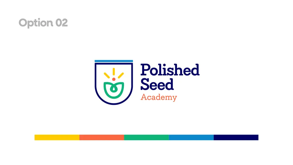
Building blocks and learning symbols, a shield with a growing seed, a house built with a caring hand, and a friendly owl mascot. The crest with the mascot became the brand: trustworthy for parents, irresistible for children.
Bright, safe and full of character.
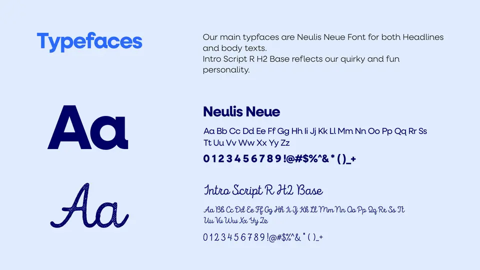
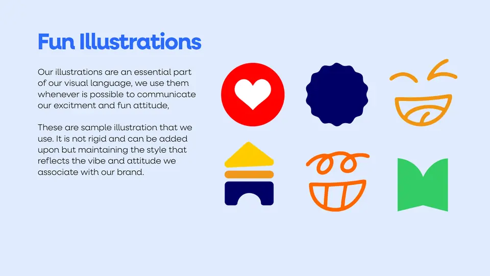
Royal blue and deep navy for trust, with green, sunshine yellow and orange for play. Neulis Neue keeps it clear; a handwritten script adds the fun, and simple illustrations carry the joy.
Typography: Neulis Neue · Intro Script

Growing bright futures, from the gate to the lunch box.
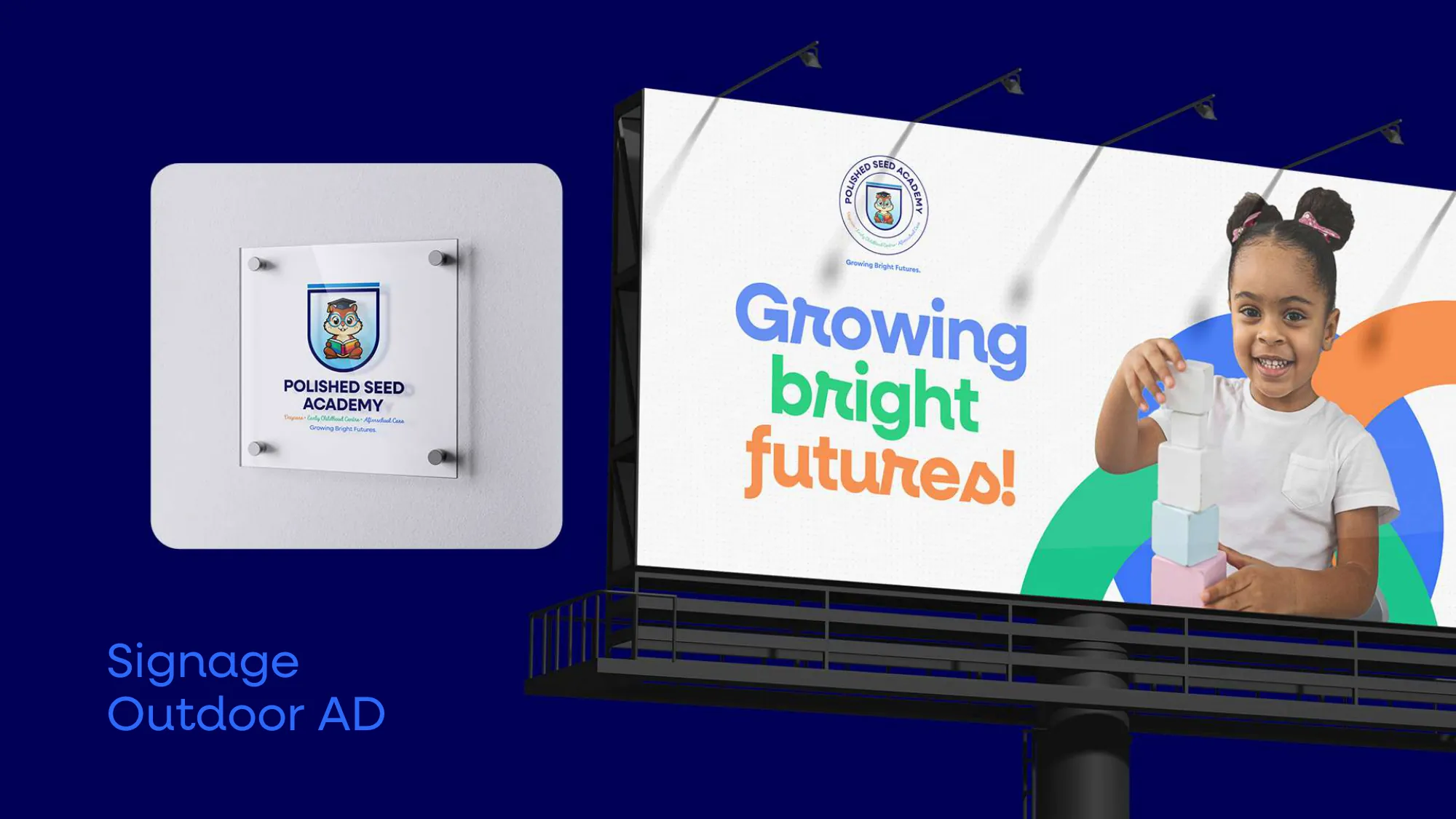
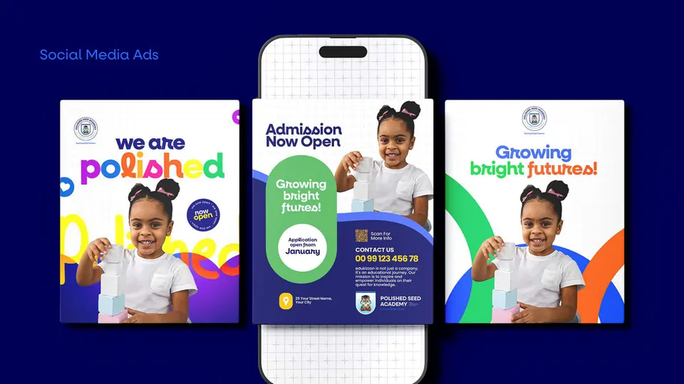
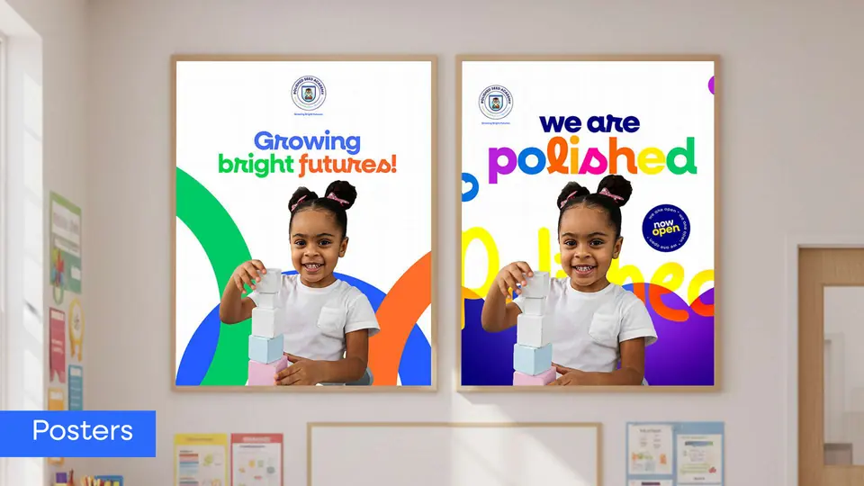
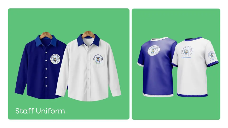
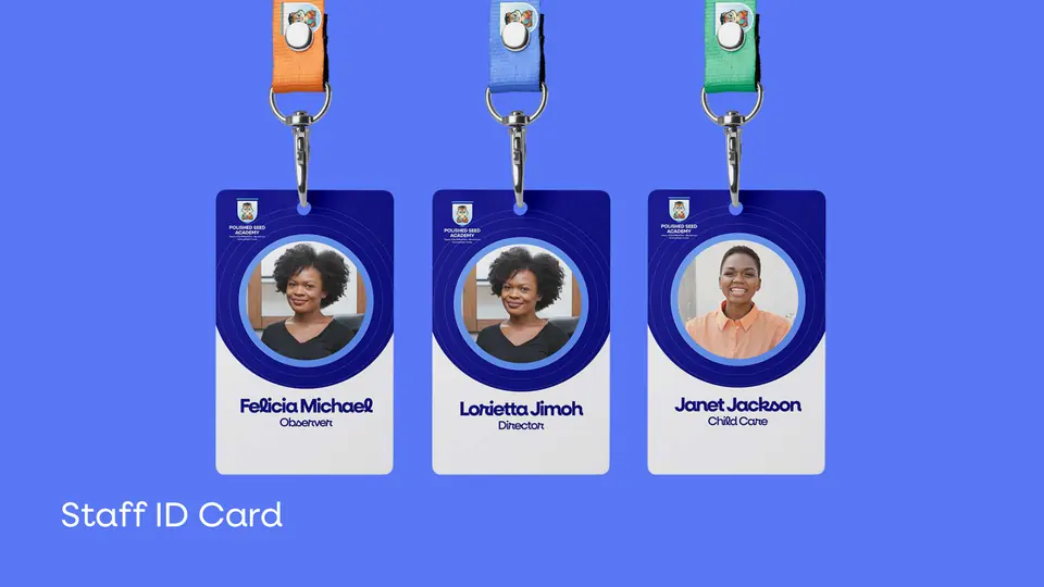
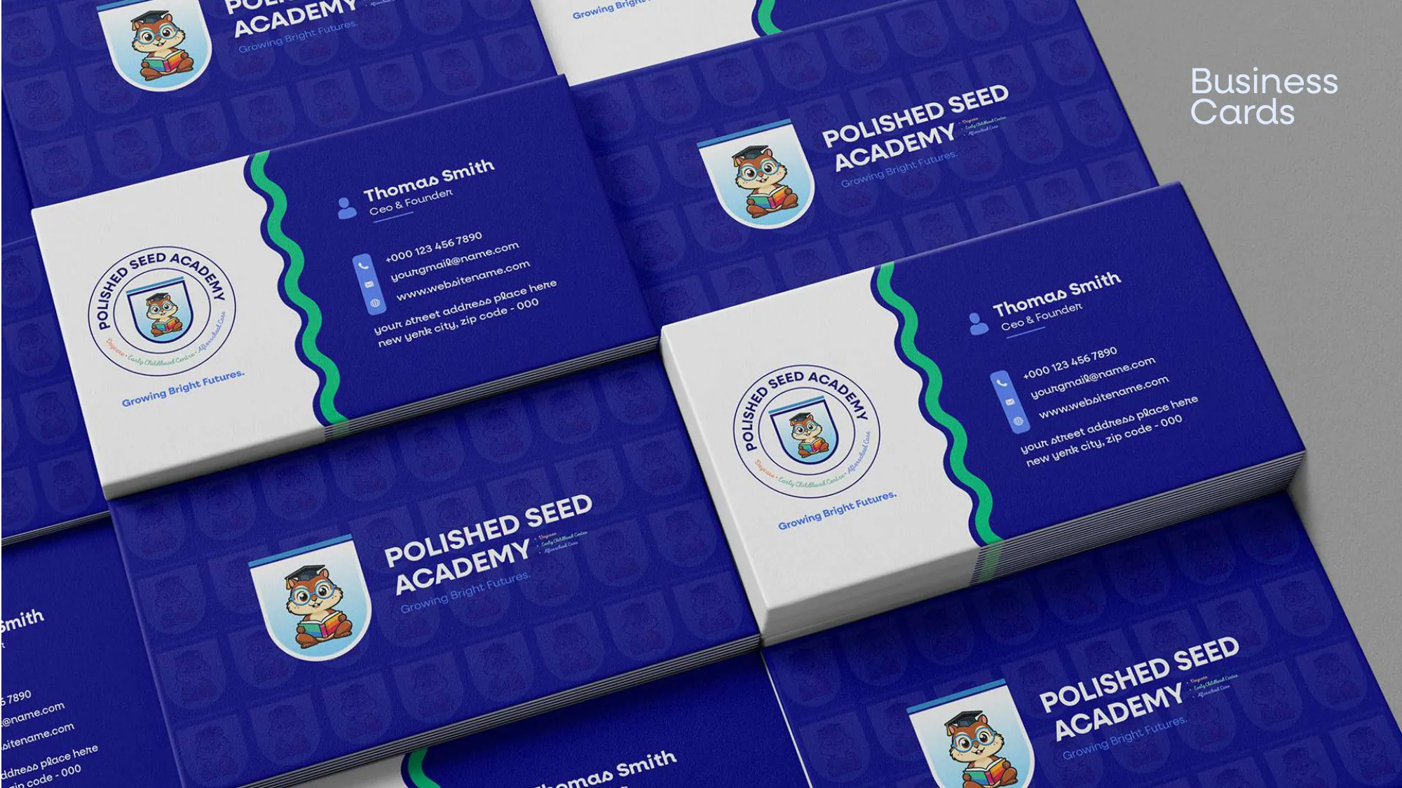
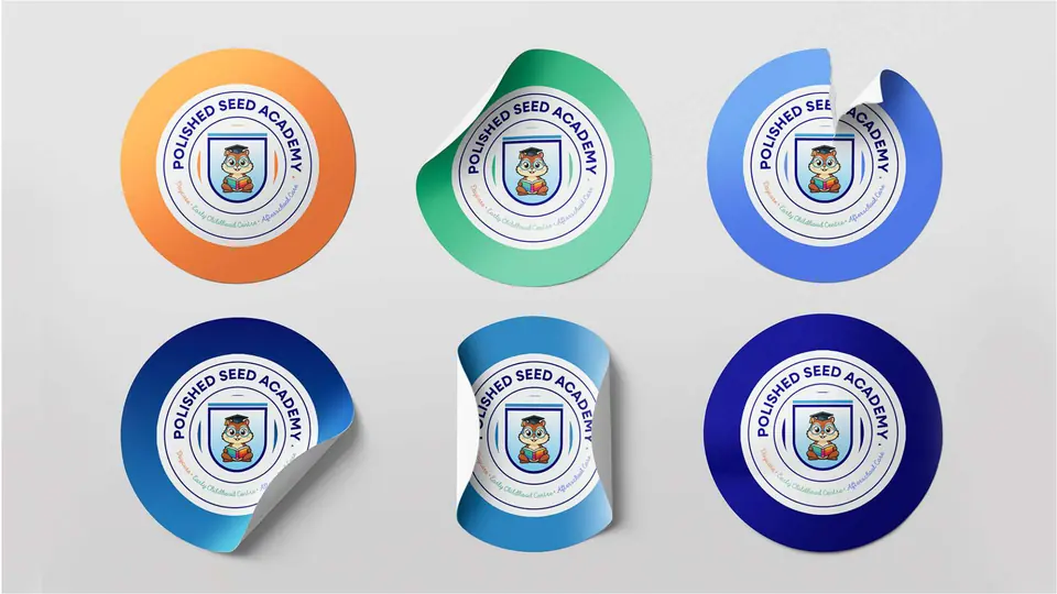
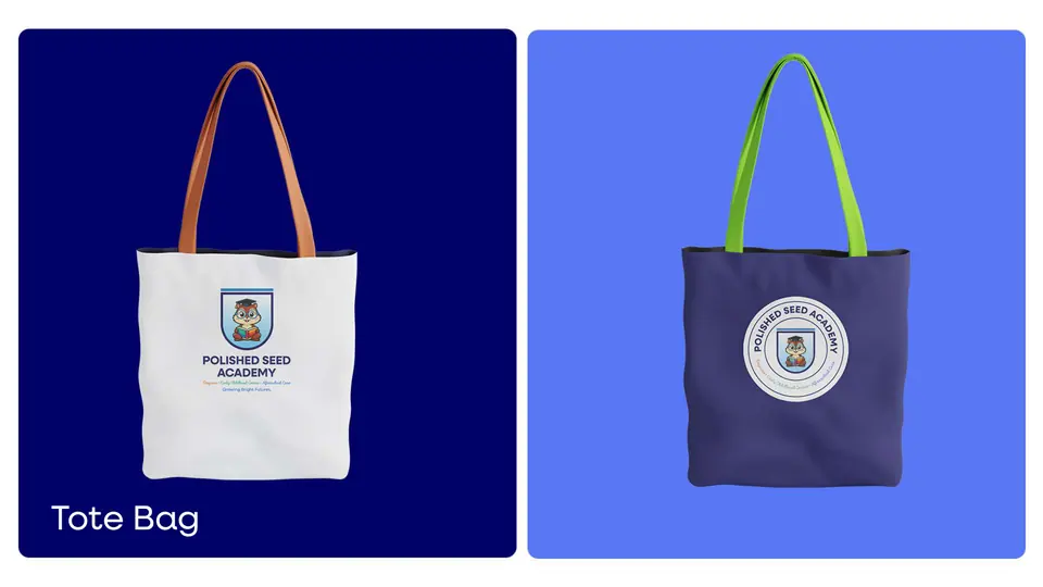
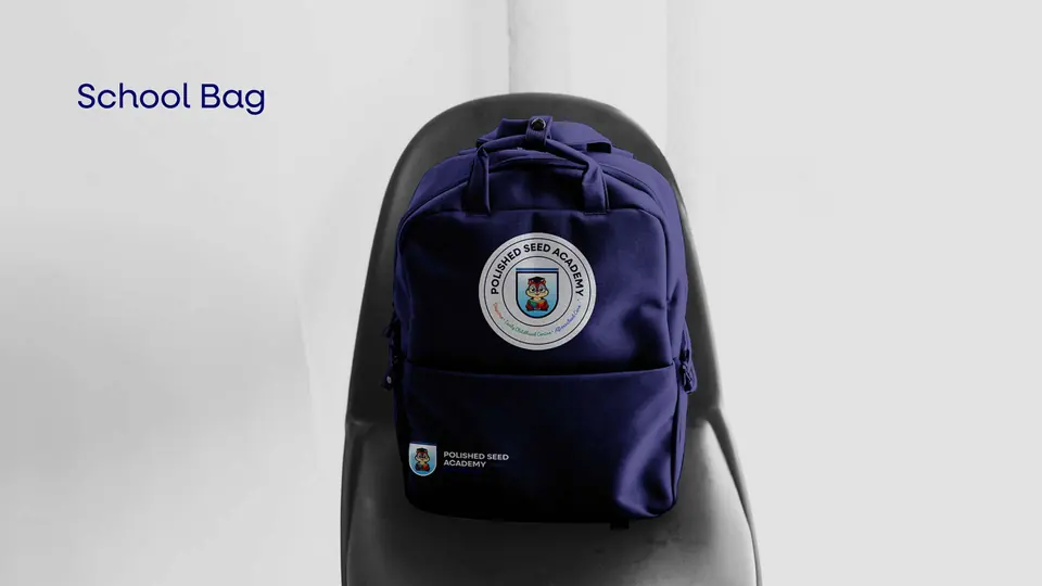
Admission ads, a billboard, posters, staff uniforms and ID cards, business cards, lunch boxes, bottles, bags and stickers: the crest and its colours everywhere a family meets the academy.