PEEPS
A brand for the world of work: professionals, employers and businesses in one place.
Overview
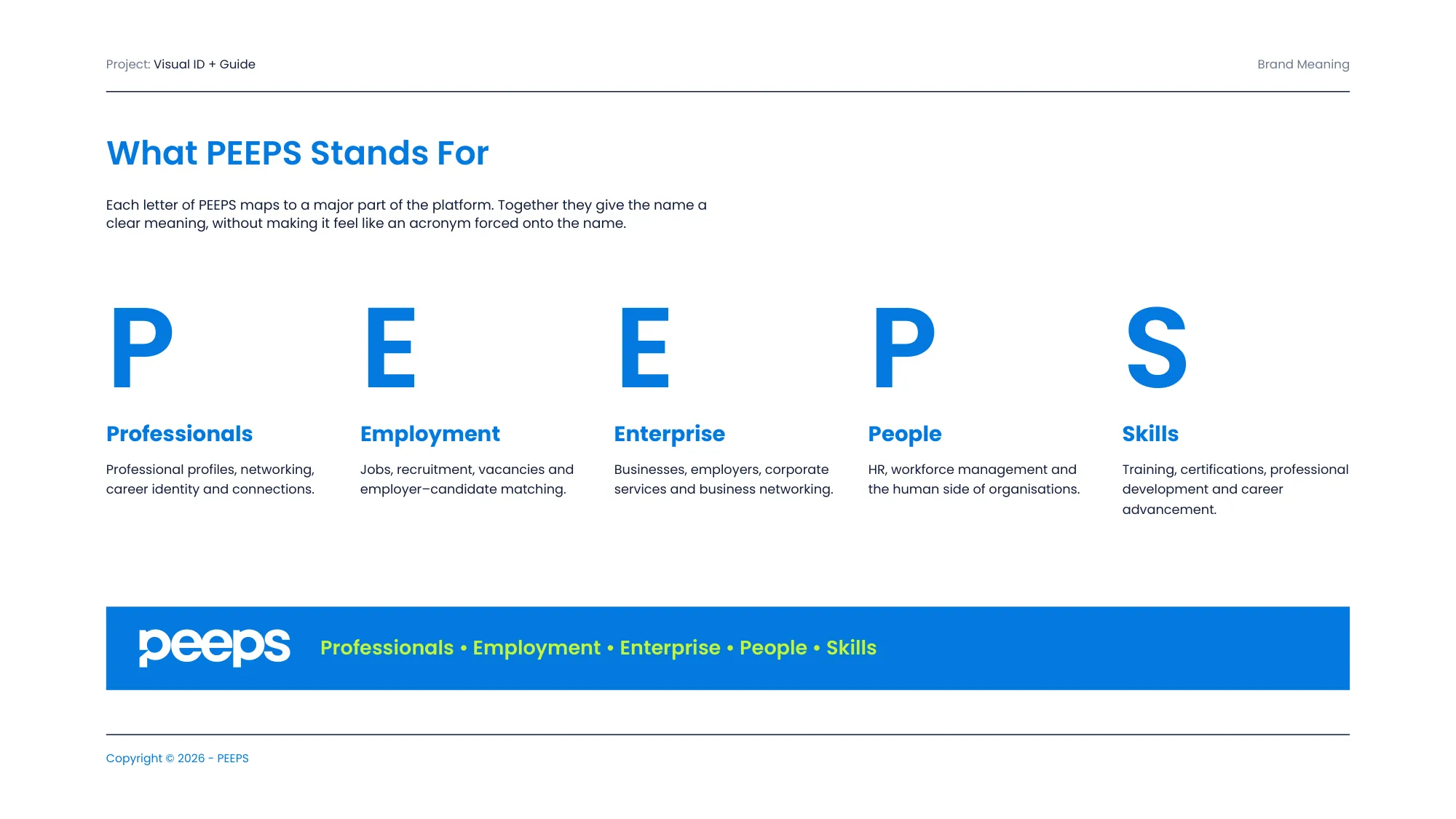
PEEPS is a platform for the world of work. It brings professionals, employers and businesses together, connecting careers, jobs, enterprise, people and skills.
The name became the strategy: Professionals, Employment, Enterprise, People, Skills. I designed the identity, a brand architecture for eight sub-brands, and the guidelines that hold them together.
Five letters, five audiences, one wordmark.
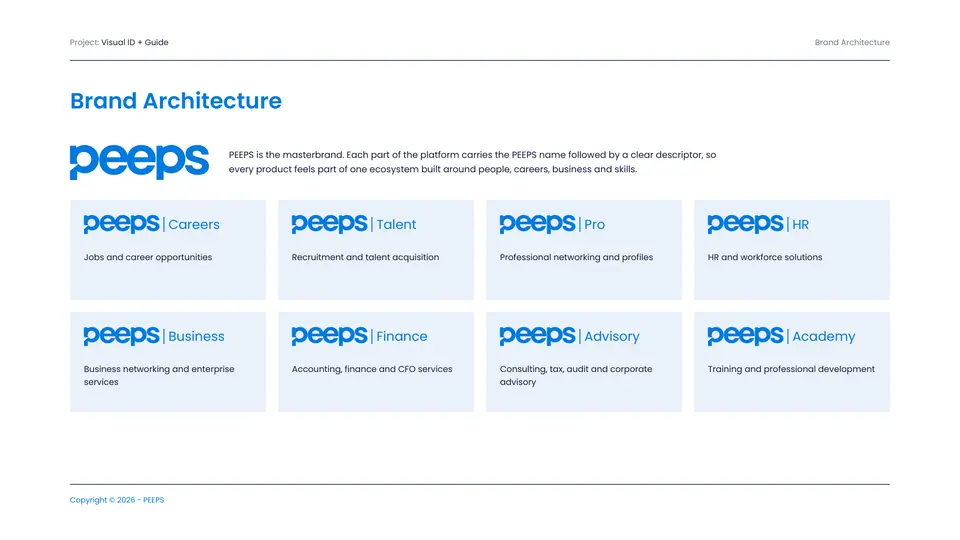
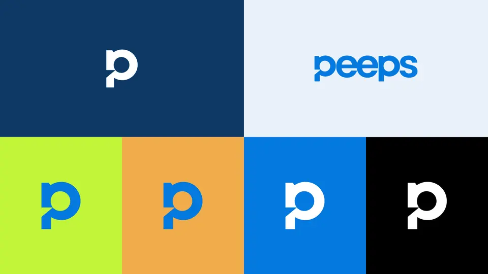
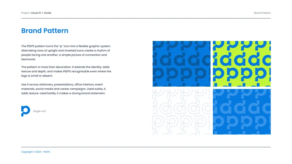
The rounded wordmark is friendly and fast to read; the “p” is pulled out as a standalone icon that also becomes a pattern. Sub-brands (Careers, Talent, Pro, HR, Business, Finance, Advisory, Academy) lock up beside it without competing.
Blue for trust, lime for momentum.
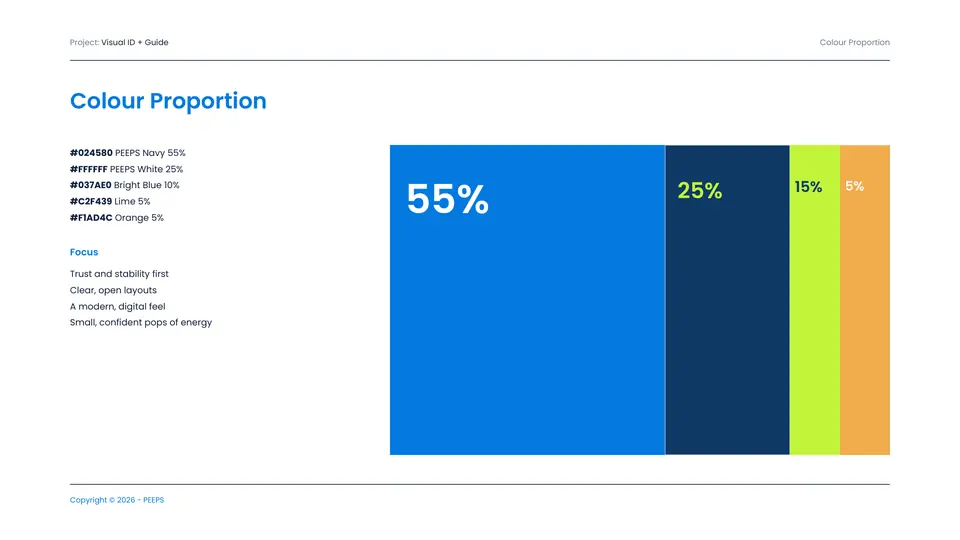
Bright blue leads at 55%, navy grounds it at 25%, and lime and orange are kept small so they always read as signal.
Typography: Poppins · Inter (fallback)
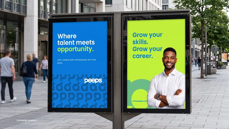
Where talent meets opportunity, on the street and in the office.
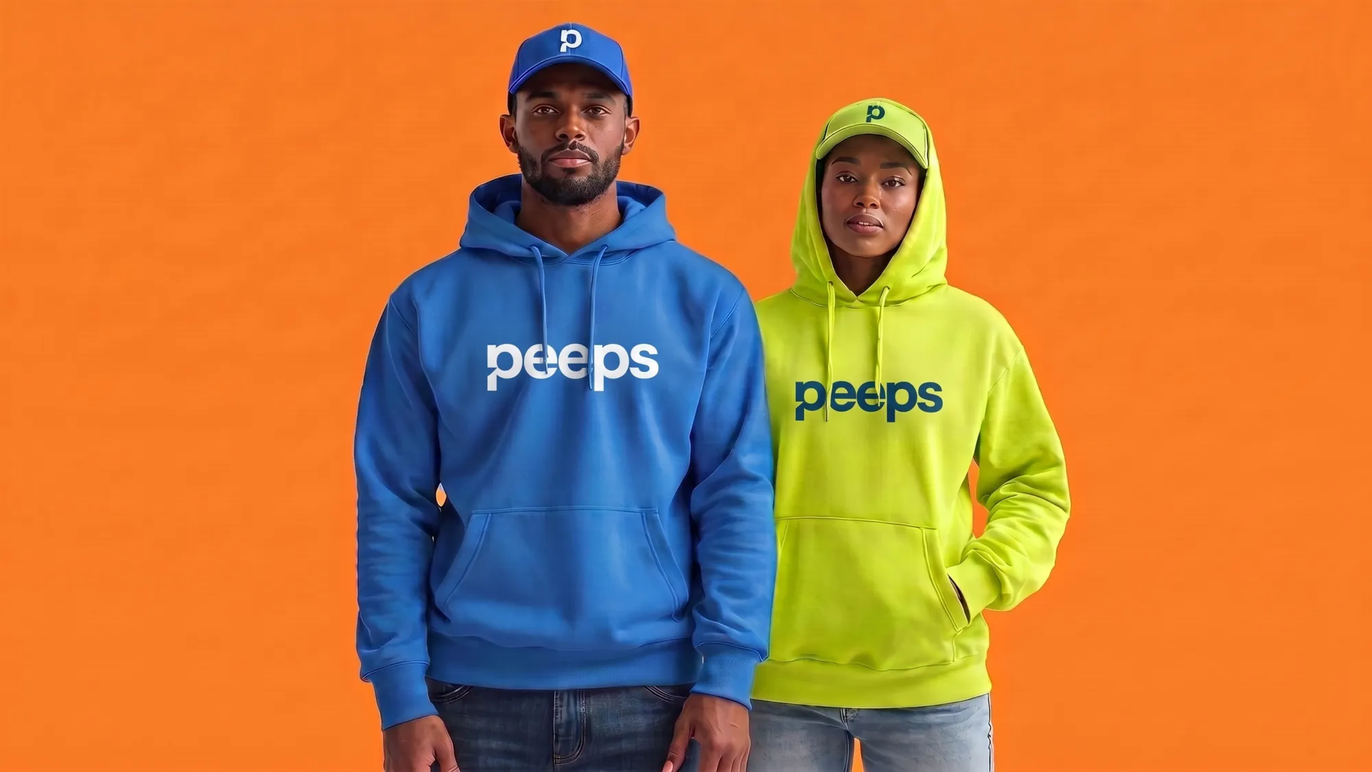
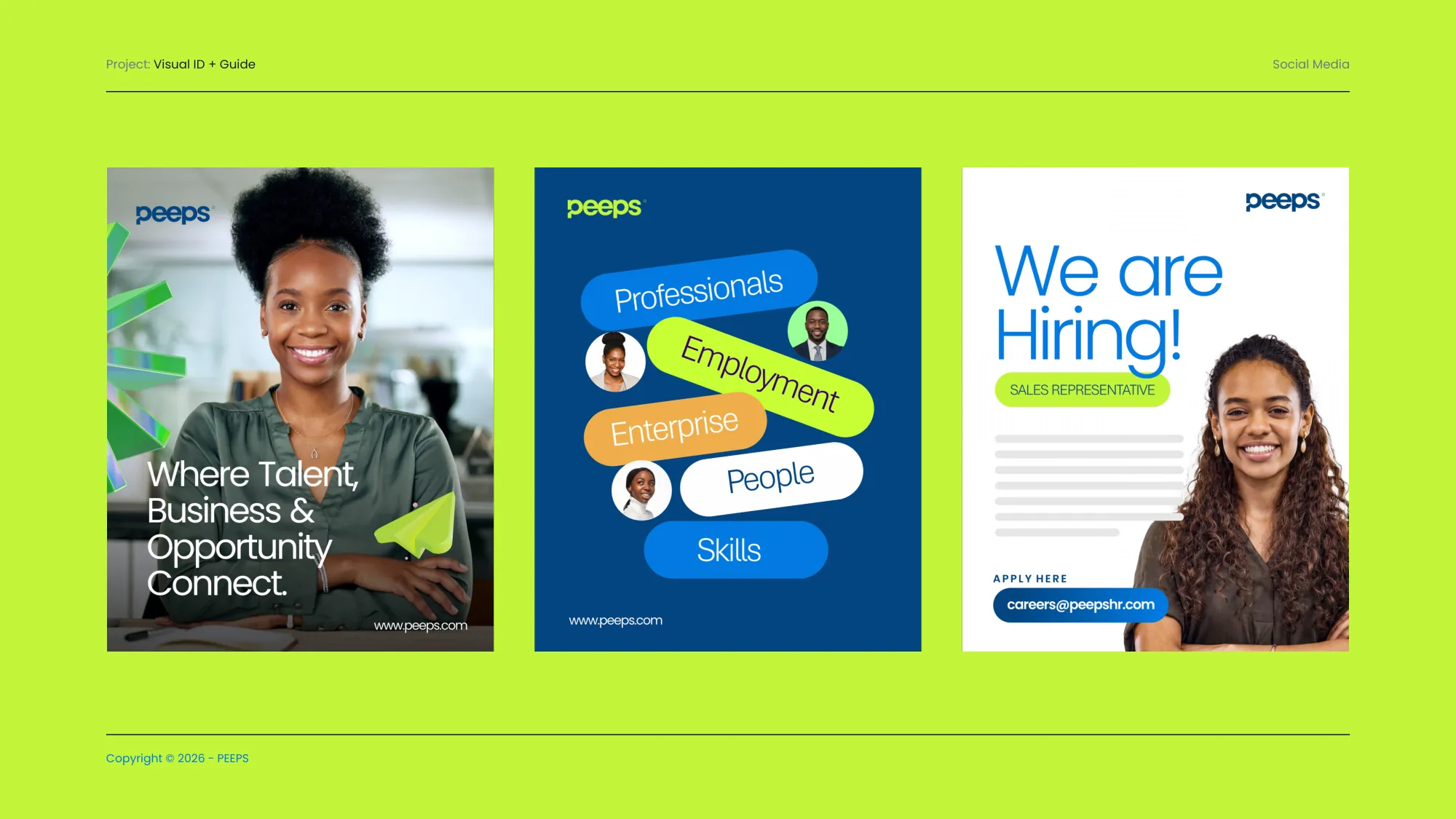
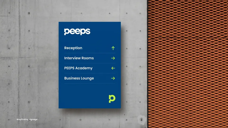
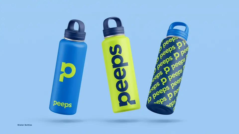
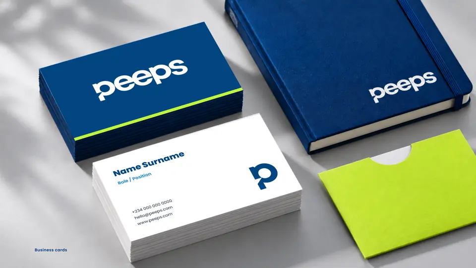
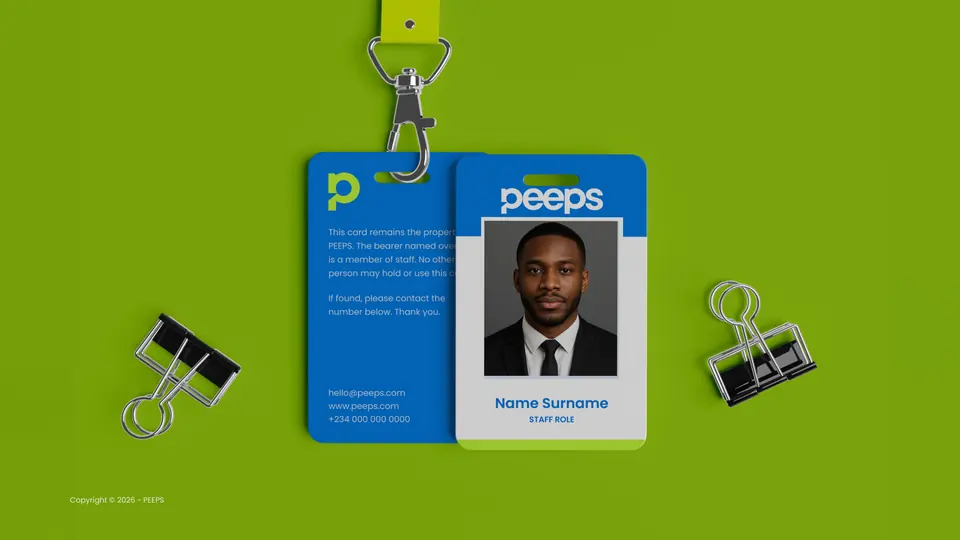
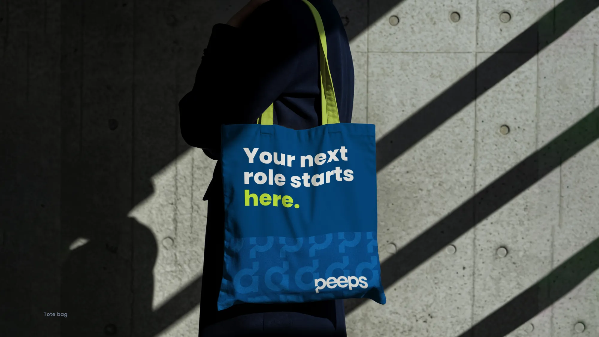
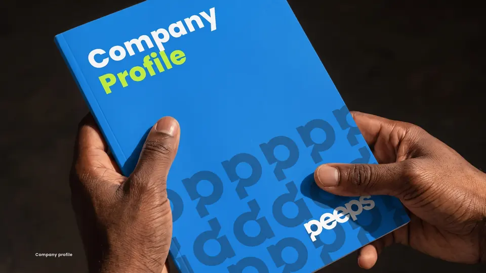
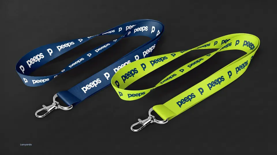
Recruitment posters, office wayfinding, reception signage, social templates and merchandise show the system working at every scale.