Vicinity Hotel
A hospitality identity built to feel close to everything that matters.
Overview
Vicinity Hotel sits inside a diversified hospitality group with sister companies in bread production, bottled water, restaurants and food services. The brand had to carry one promise across all of it: a stay that feels familiar, welcoming and close to what guests care about.
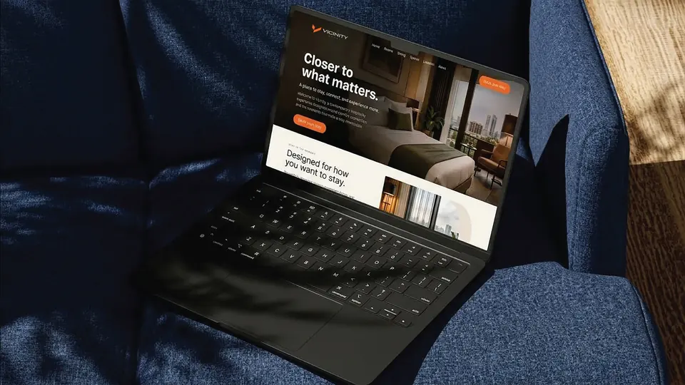
I designed the identity and wrote the full brand and style guide, the mark, colour, typography, photography direction, communications and the physical world the brand lives in, from uniforms to the delivery truck.
The mark had to work as a welcome and as a wayfinding sign.
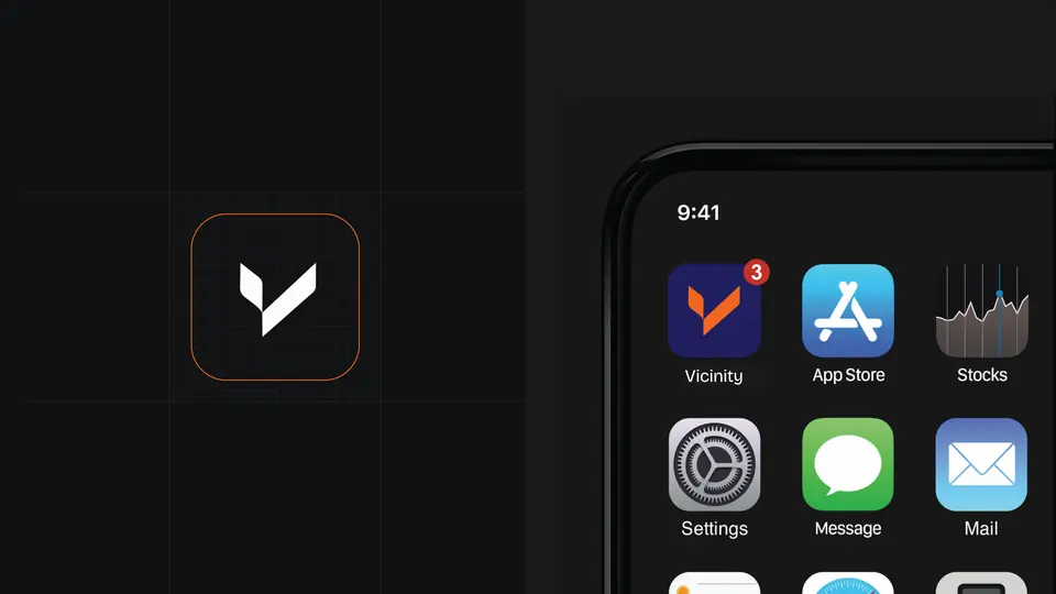
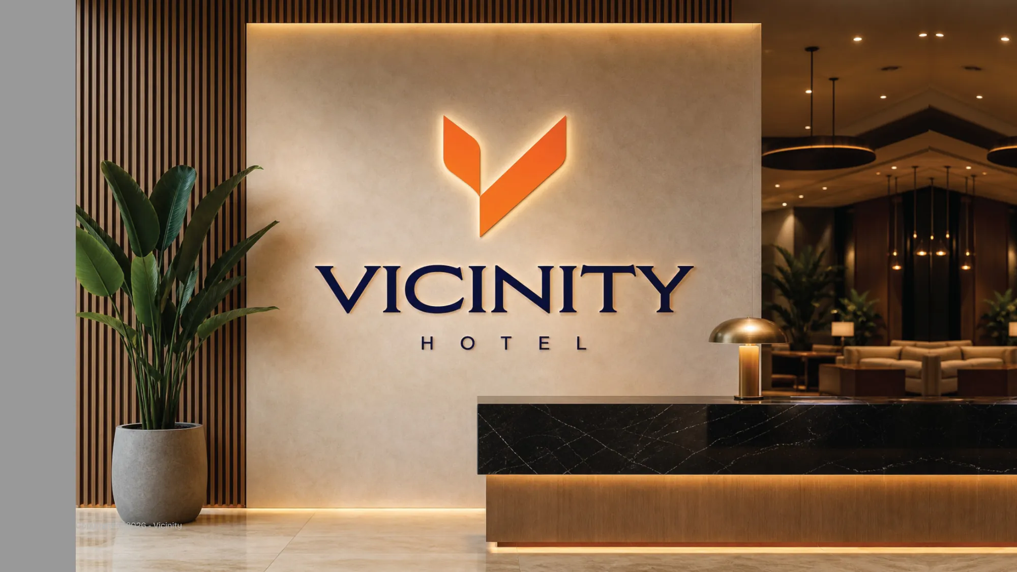
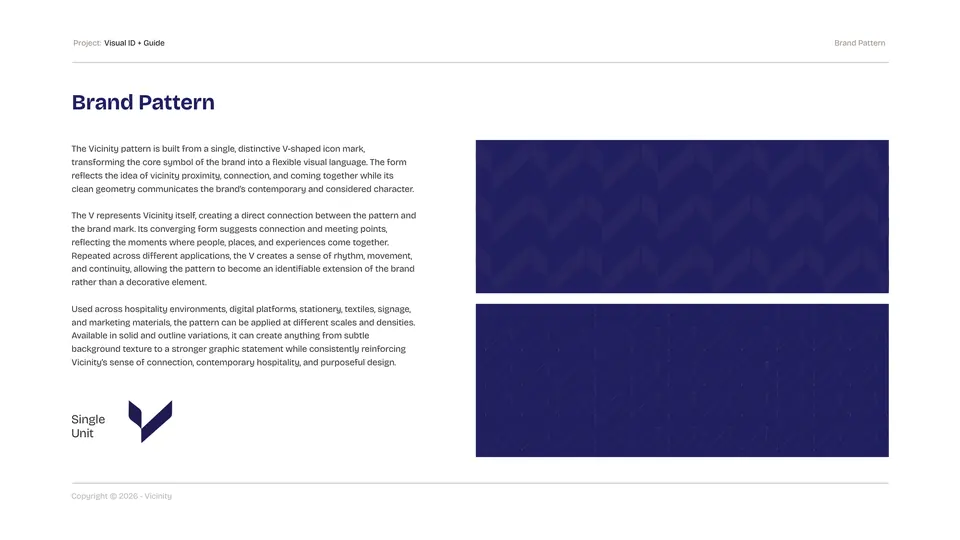
The V symbol is built from two converging strokes: arrival, and the meeting point between guest and host. It locks up with a calm, tracked wordmark and holds at every size, from an app icon to the lobby wall.
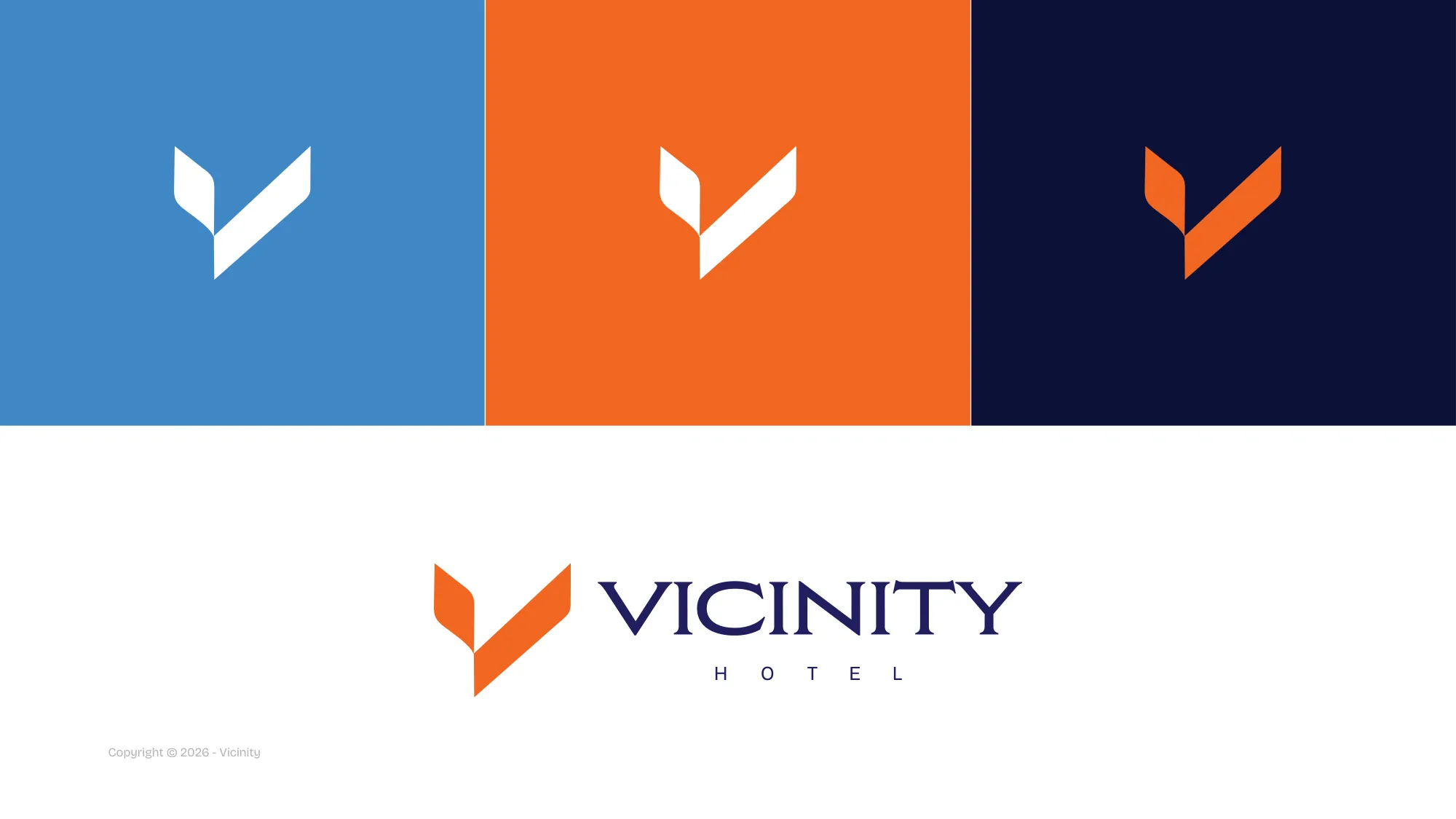
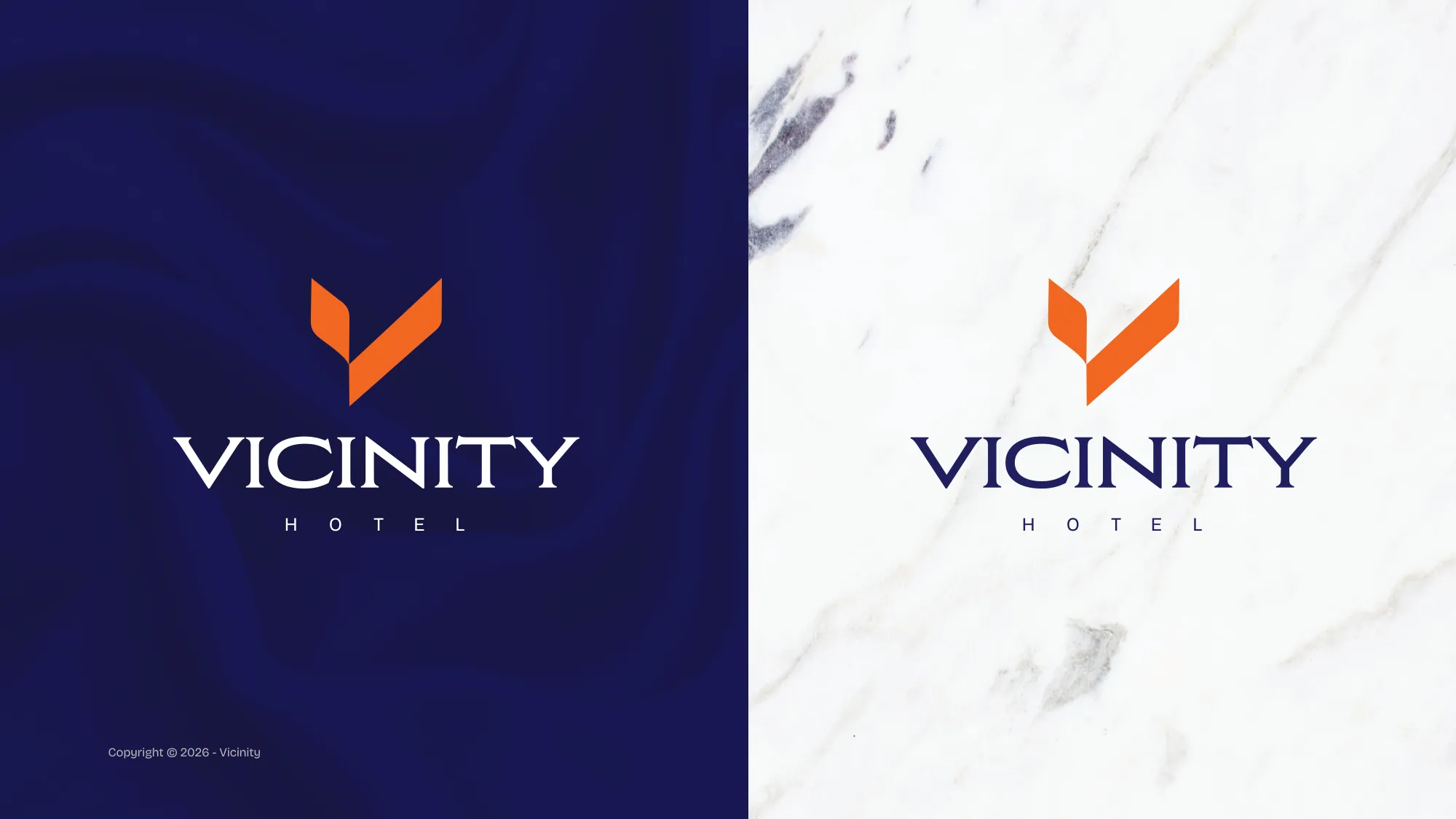
Midnight carries the authority; Ember carries the warmth.
A deep midnight blue anchors the system, sky blue keeps it light, and a single ember orange does the welcoming. Proportions are fixed in the guide so every touchpoint feels like the same building.
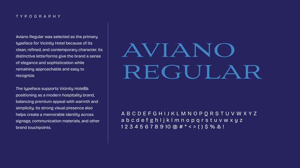
Typography: Aviano Regular · Bricolage Grotesque · Inter
Then the brand went out into the street.
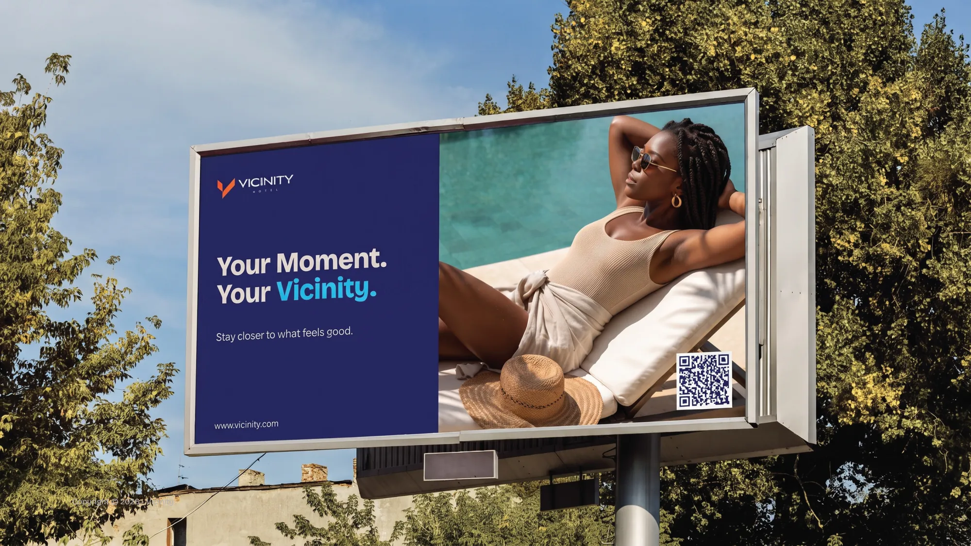
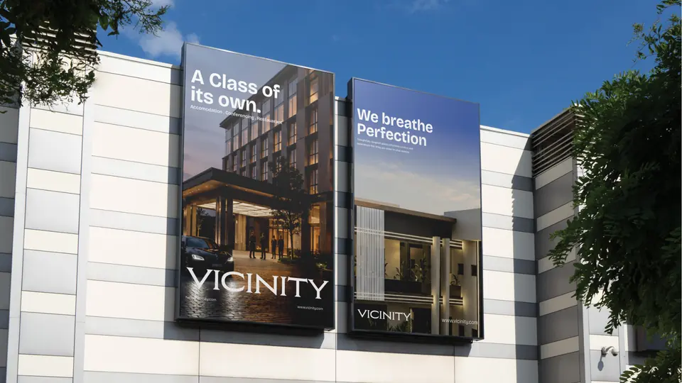
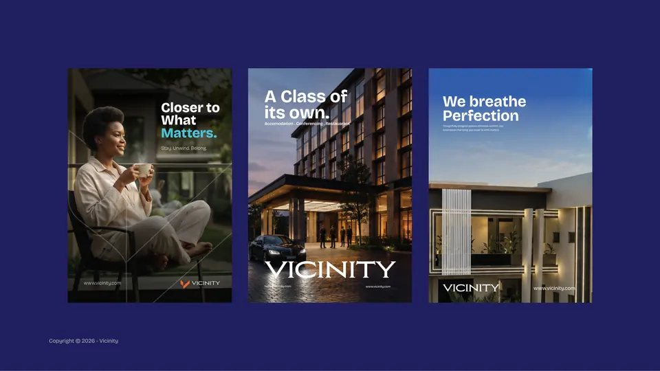
Billboards, building banners and posters carry short, confident lines: “Your Moment. Your Vicinity.”, “A Class of its own.”, “We breathe Perfection”.
And into every hand a guest touches.
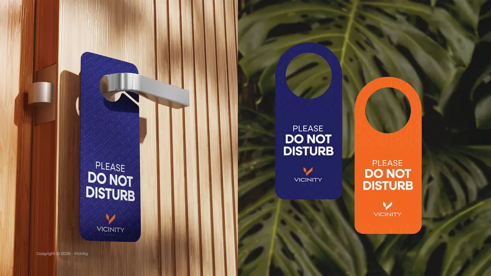
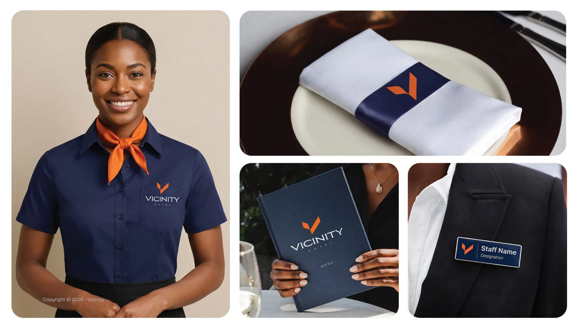
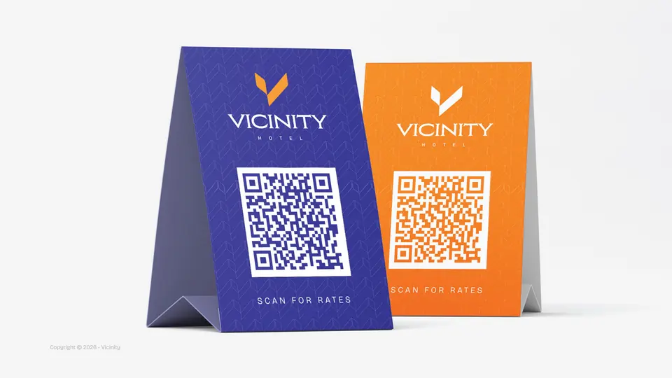
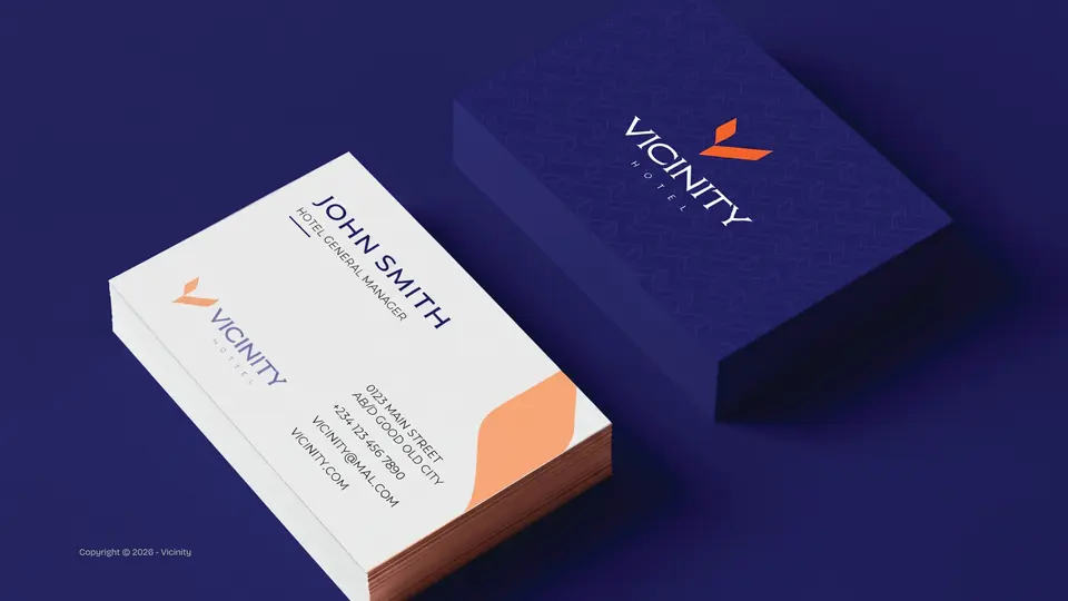
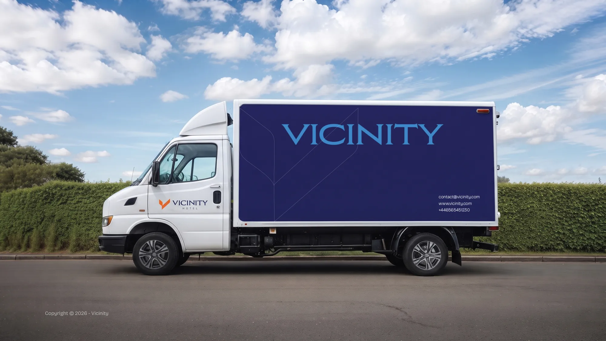
Room amenities, door hangers, QR table tents, key cards, stationery, staff uniforms and the hotel car, each specified in the guide so the experience never breaks character.